The art supports the design. The design is spot on. So why does something still feel...off?
More often than not, it's a sizing issue.
Artwork that's too small feels disconnected. Too large, and it overwhelms the room. Scale isn't just a finishing touch—it's fundamental to how a space is experienced.
Here are five rules designers rely on to get it right.
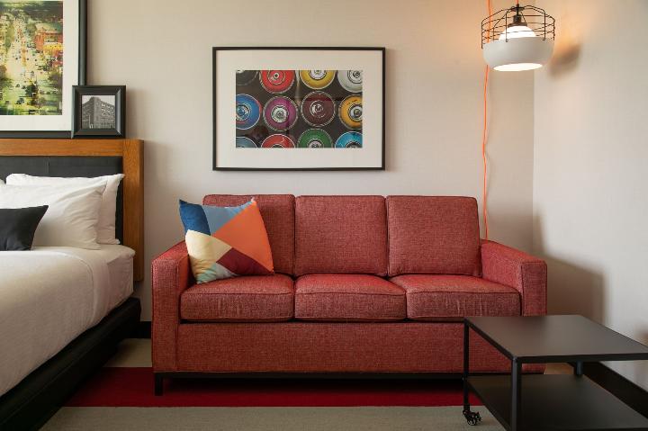
1. The Two-Thirds Rule
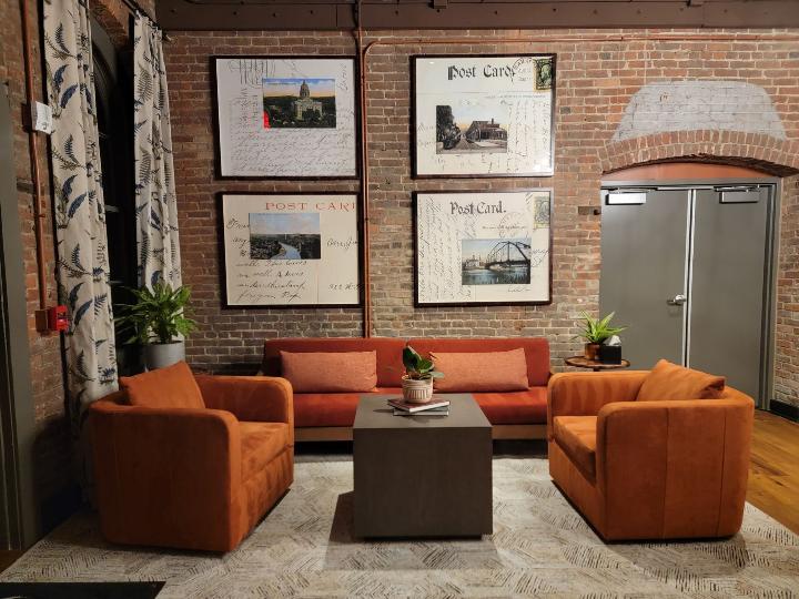
When art hangs above furniture—a bed, a sofa, a credenza—it should span roughly two-thirds the width of what's beneath it. Not the whole wall. Not the whole piece of furniture. Two-thirds.
This simple ratio keeps artwork visually balanced with the furniture below. A queen bed is typically 60 inches wide, so the art above it ideally lands around 40 inches. A 72-inch sofa? Think 48 inches of art.
Simple math. Big impact.
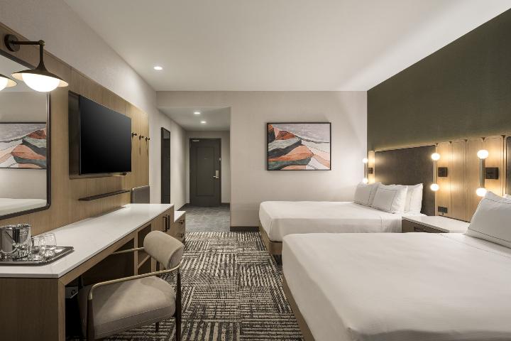
2. Ceiling Height Changes Everything
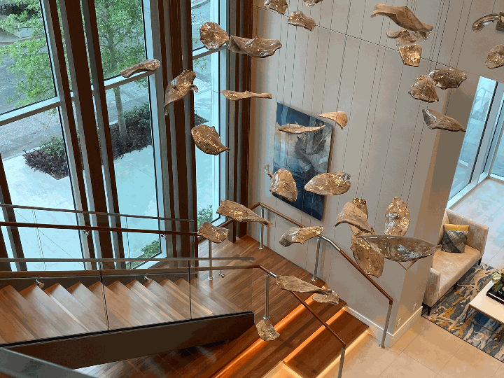
A piece that looks stunning in a standard 8-foot room can feel like a postage stamp in a 14-foot atrium lobby. Scale is always relative—and ceiling height is one of the biggest factors.
As a general rule: the taller the space, the larger (and often taller) the art needs to be. Vertical compositions help draw the eye upward and make use of that height. In lower-ceilinged spaces, wider, horizontal pieces tend to open things up without competing with the ceiling.
Read the room—literally.
3. Hang It at Eye Level
Museums hang art so the center of the piece sits at about 57 to 60 inches from the floor—average human eye level. Hospitality spaces should follow suit.
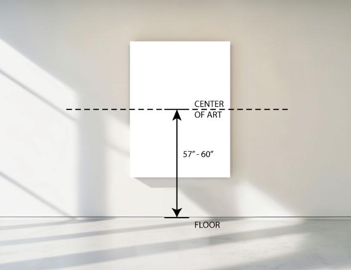
The most common mistake? Hanging art too high. It feels formal, distant, and a little odd—like the art is trying to escape the room. Drop it down. Let guests actually meet the piece.
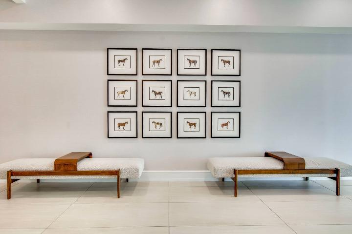
4. Treat a Gallery Wall Like One Big Piece
Think of a gallery wall as one unified composition rather than a collection of individual pieces.. That overall composition should still follow the two-thirds rule relative to the furniture or wall it anchors.
Inside the grouping, keep spacing tight and consistent—typically 2 to 3 inches between frames. Any more and the pieces start to feel unrelated. Any less and it looks cluttered.
Before hanging, lay everything out on the floor to fine-tune spacing and composition.
5. When in Doubt, Go Bigger
This one surprises people, but it's almost always true: when you're torn between two sizes, choose the larger one.
Small artwork in a large space reads as an afterthought. Larger artwork feels intentional—even bold. Guests remember a statement piece. They rarely think artwork is slightly too large, but they almost always notice when it feels too small.
Be confident. The space can handle it.
Great artwork doesn't compete with a space—it completes it. Getting the scale right is one of the details that transforms a well-designed room into one guests remember.
At Spacia, we're here to support your vision every step of the way. Whether you know exactly what you need or just want a second set of eyes before production, our team is always ready to help make the process simple, seamless, and successful.