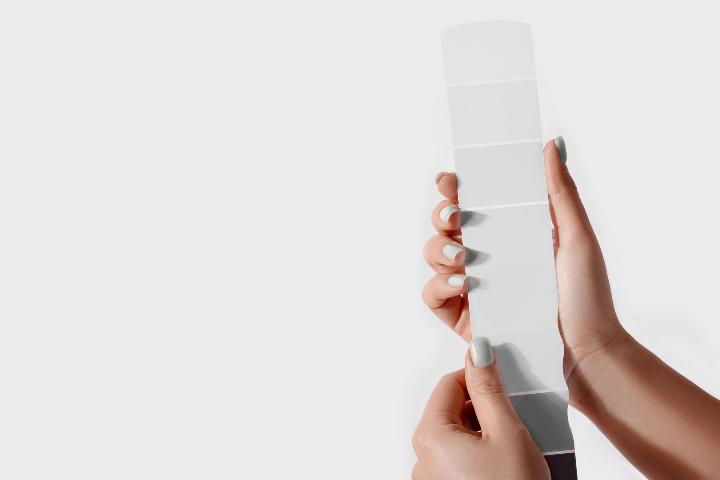
Drum roll, please. Earlier this month, Pantone announced the 2026 Color of the Year—and it's a first. For the first time since Pantone began naming an annual Color of the Year more than two decades ago, the spotlight shines on a shade of white: Cloud Dancer (11-4201).
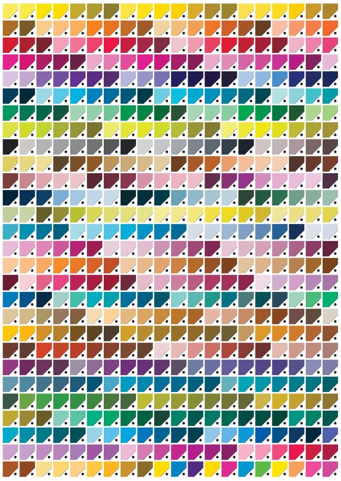
Before we drift above it all, what makes Pantone the expert? Pantone is considered the global authority on color and a trusted resource for designers, brands, and manufacturers worldwide. Best known for the Pantone Matching System (PMS), Pantone provides a universal color language that ensures accuracy and consistency across materials and industries. Through digital and physical color standards, advanced color-management tools, and expert consulting from the Pantone Color Institute, Pantone supports color decisions from concept to completion—all while influencing design, fashion, interiors, branding, and culture through trend forecasting and its annual Color of the Year.
Pantone's 2026 Color of the Year is described as a "lofty white neutral" meant to evoke clarity, serenity, and a fresh start amid the buzz of modern life. (Forbes)
Leatrice Eiseman, Executive Director of the Pantone Color Institute, calls Cloud Dancer a color that "enhances our focus" and offers a backdrop for creative expression rather than sensory overload. (Hotel Management)
Now, with our heads in the clouds, what does this quiet, almost invisible choice mean for design — especially hospitality design — where ambiance is everything?
The Allure of Cloud Dancer
- Creates Calm, Restful Spaces
Cloud Dancer is meant to soften visual noise, promoting a sense of peace and spaciousness. In hospitality, this can translate into soothing lobbies, spa areas, and guest rooms that feel like retreats from daily life. (Forbes) - Ultra-Versatile Foundation
Off-white is a neutral that pairs well with nearly any palette — from warm woods and metals to deep blues and greens — giving designers freedom to layer materials and accents without clashing. (Skylum) - Reflects Light and Enhances Space
In naturally lit areas, Cloud Dancer can make interiors feel brighter and airier, a huge plus in hotels where creating a welcoming sense of spaciousness is key. (ArchDaily) - Supports Wellness and Mindful Design
This calming hue aligns with the broader trend of wellness-driven spaces — rooms curated for rest, meditation, and mental well-being. For boutique and luxury hotels, that can be a competitive edge. (Resident Magazine) - Excellent for Layering Textures
Because it’s not sterile or stark, Cloud Dancer works beautifully with tactile materials — think boucle upholstery, natural stone, linen drapery, or wood grain finishes that add visual richness without color noise. (Nicole Arnold Interiors)
The Other Side of Serene
- Risk of Feeling “Too Safe”
Critics argue that a neutral white choice feels uninspired or overly cautious compared with bold colors of past years. Some see Cloud Dancer as a “pause” in design rather than a direction forward. (Homes and Gardens) - Perceived Sterility Without Thoughtful Detail
In large hospitality spaces like banquet halls or corridors, relying too heavily on a pale neutral without enough texture or contrast can feel clinical or bland. Strategic use of accents or finishes becomes crucial. (Forbes) - Practical Concerns
Whites — even soft whites — can show wear in high-traffic hotel areas. Entrances, elevators, and guestroom walls may require more maintenance or protective finishes. This isn’t impossible, but worth planning for.
How Cloud Dancer Might Shape the Next Chapter of Hospitality Design
- Wellness-First
Hotels are doubling down on wellness amenities. Cloud Dancer fits well in: - Spas and Meditation Rooms - to express tranquility and reduce sensory distraction. (Resident Magazine)
- Quiet Lounges — as a calming backdrop for soft seating, natural textiles, or scent experiences.
Mandarin Oriental, Pantone’s official hospitality partner for 2026, is already incorporating the hue across experiences — from Cloud Dancer-inspired afternoon teas to oxygenating spa rituals and serene décor moments in several global properties. (Mandarin Oriental)
- Layered Minimalism
Rather than stark minimalism, we'll likely see soft minimalism — rooms that feel modern yet warm, anchored by gentle neutrals and highlighted by: - Natural Wood Tones
- Polished Brass, Bronze or Satin Nickel
- Textured Textiles (Bouclé, Linen)
- Strategic art or accent pieces (<<< Spacia can help with that!)
In this approach, Cloud Dancer functions as a quiet canvas, not the main event. (Livingetc)
- Strategic Contrast for Depth
Designers suggest pairing Cloud Dancer with deeper, richer tones — navy, charcoal, olive, or terracotta — to create drama and sophistication without overwhelming the senses. (Resident Magazine) - Transitional and Multi-Use Spaces
Hotels increasingly offer flexible spaces — think co-working lounges that transition to evening social hubs. Cloud Dancer provides a neutral backdrop that feels professional by day and serene by night without extensive redecoration. - Light-Filled Lobbies and Guestrooms
Large, bright open spaces benefit from Cloud Dancer’s ability to reflect natural light, making rooms feel more inviting and spacious, an advantage especially in urban hotels where daylight access may be limited.
Pantone’s Cloud Dancer may not sweep design with bold color statements, but its selection signals a shift toward restraint, intentionality, and emotional calm — ideals that align neatly with modern hospitality design trends.
For hotels, this means spaces that feel restorative, refined, and flexible, where color doesn’t shout, but supports the overall experience — from wellness retreats to bright, airy public spaces.
Whether embraced as a foundational backdrop or sparingly accented for contrast, Cloud Dancer invites designers to think beyond color toward how space makes people feel — a notion that, in hospitality, is the real art of design.
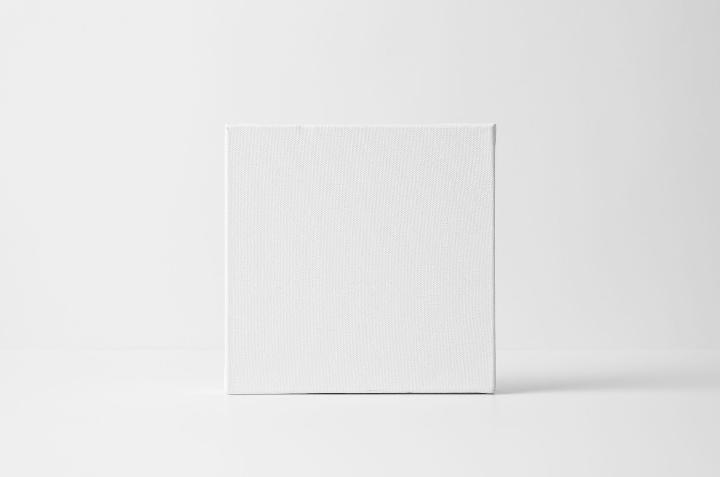
And one final thought—According to Pantone’s Vice President, Laurie Pressman, “Similar to a blank canvas, Cloud Dancer signifies our desire for a fresh start”, opening up space for imagination and new ideas to take shape. (KNKX Public Radio)
Describing Cloud Dancer as a blank canvas is music to our ears! As a company committed to creating custom artwork, we see a blank canvas full of possibilities. We're eager to support your design narratives in the coming year. Let's get to work!